
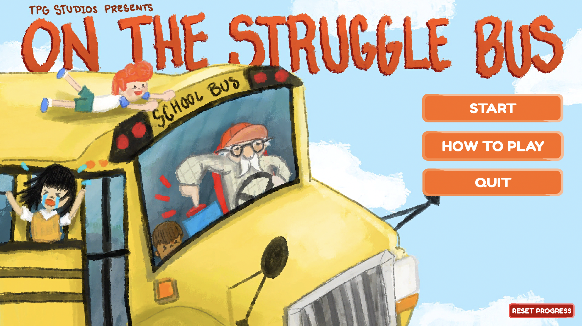
On the struggle bus
2022
Unity, Figma, Procreate, Blender, C#
My roles: user experience design, environment design, story creation
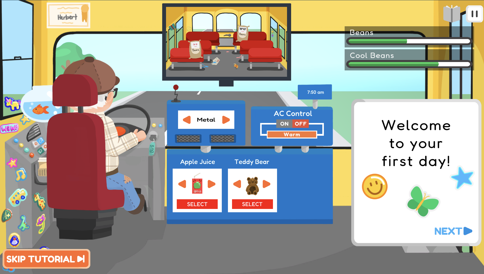
Over the course of 4 months in the winter semester of 2022, myself and a group of three others developed an original game called 'On The Struggle Bus.' From a list of 100+ ideas for original games, we narrowed it down to a game based on the classic childhood experience of riding the school bus but from a new perspective– the bus driver’s. The player, who takes the form of Herbert the bus driver, is tasked with taking charge of a school bus full of unruly kids, each with their own unique likes and dislikes, and tasked with managing their behaviour while monitoring their happiness levels, all with the goal of bringing them to school on time.
Play the game here (computer only)
The Beginnings
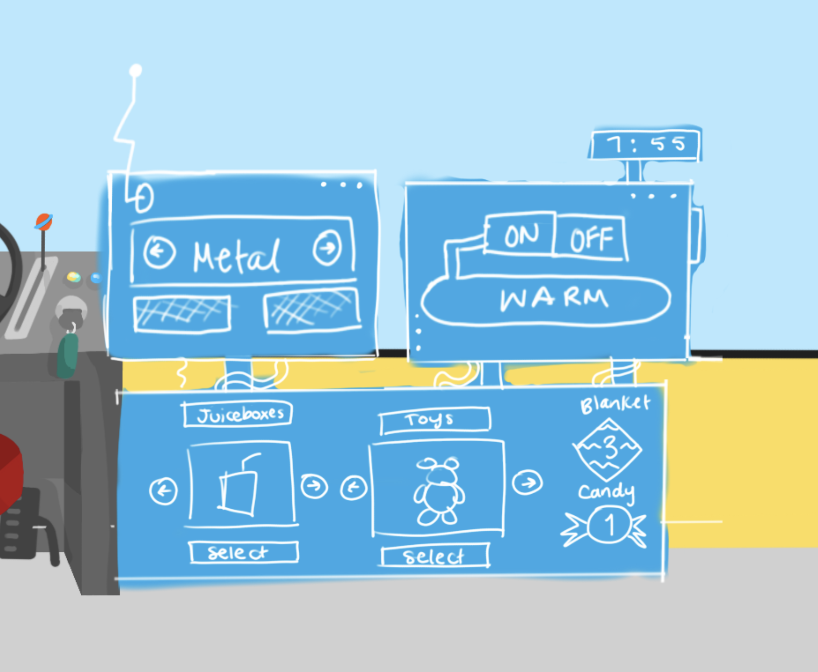
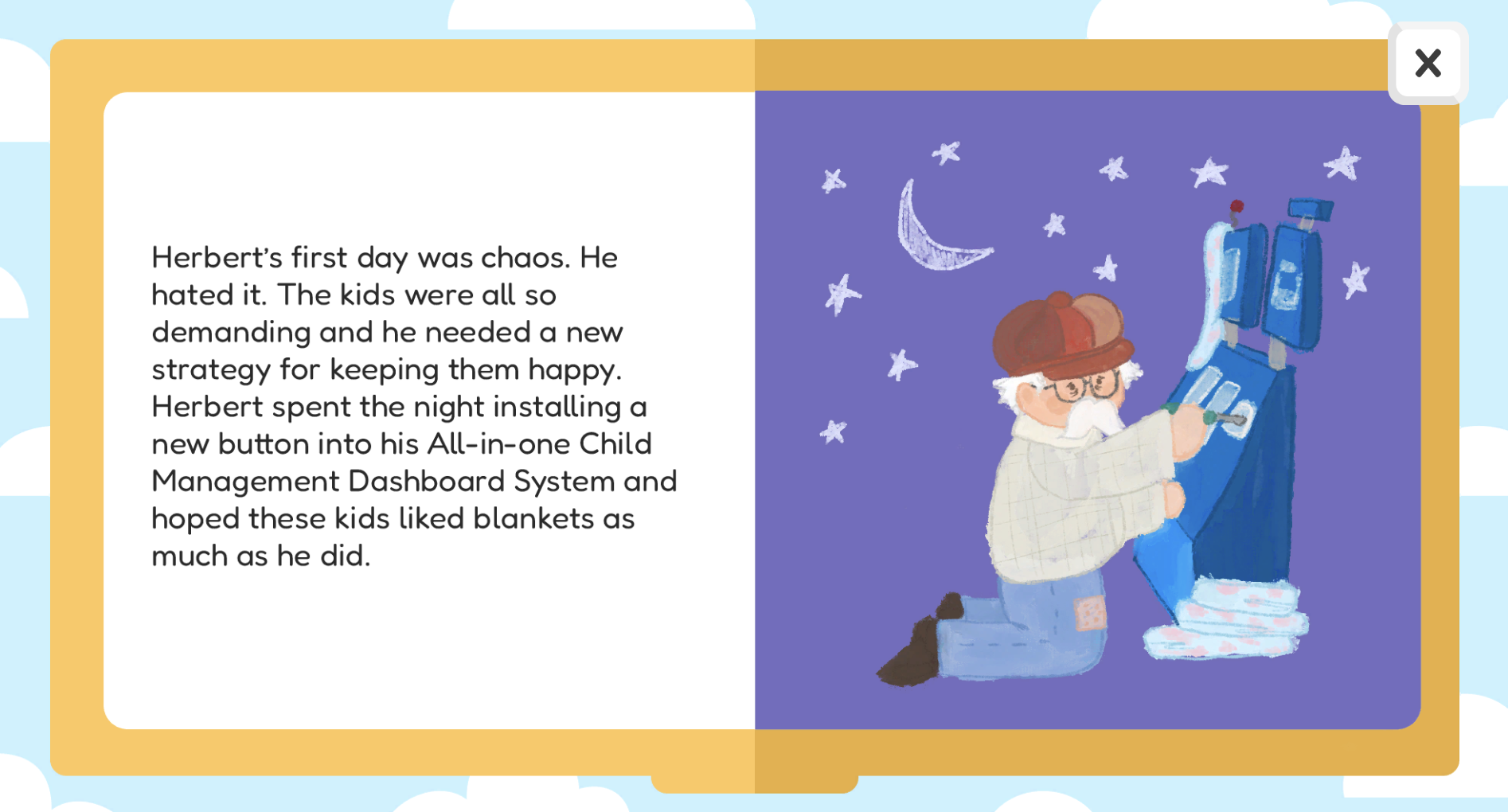
The idea came from a frenzied brainstorm session where, as a group, we had to come up with as many ideas as we could in 15 minutes based on original game themes and their core mechanics. At some point, I suggested we make a school bus game where the player is an angry driver and gets to eject kids from the bus (disclaimer: kids are great). As a group, we decided that this unique perspective on the school bus is something we wanted to elaborate on more and came up with a fun name: On The Struggle Bus. I love storytelling, so I came up with a tale about a bus driver named Herbert who had to take charge of a bus full of unruly kids using his state-of-the-art control board system made especially for bus drivers which, unfortunately, didn't have an eject button. Since the control board was the most important interaction in our game, Here's some sketches I made for our pitch to some local game developers:

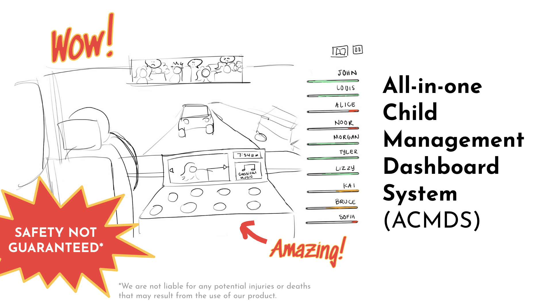
Control Board
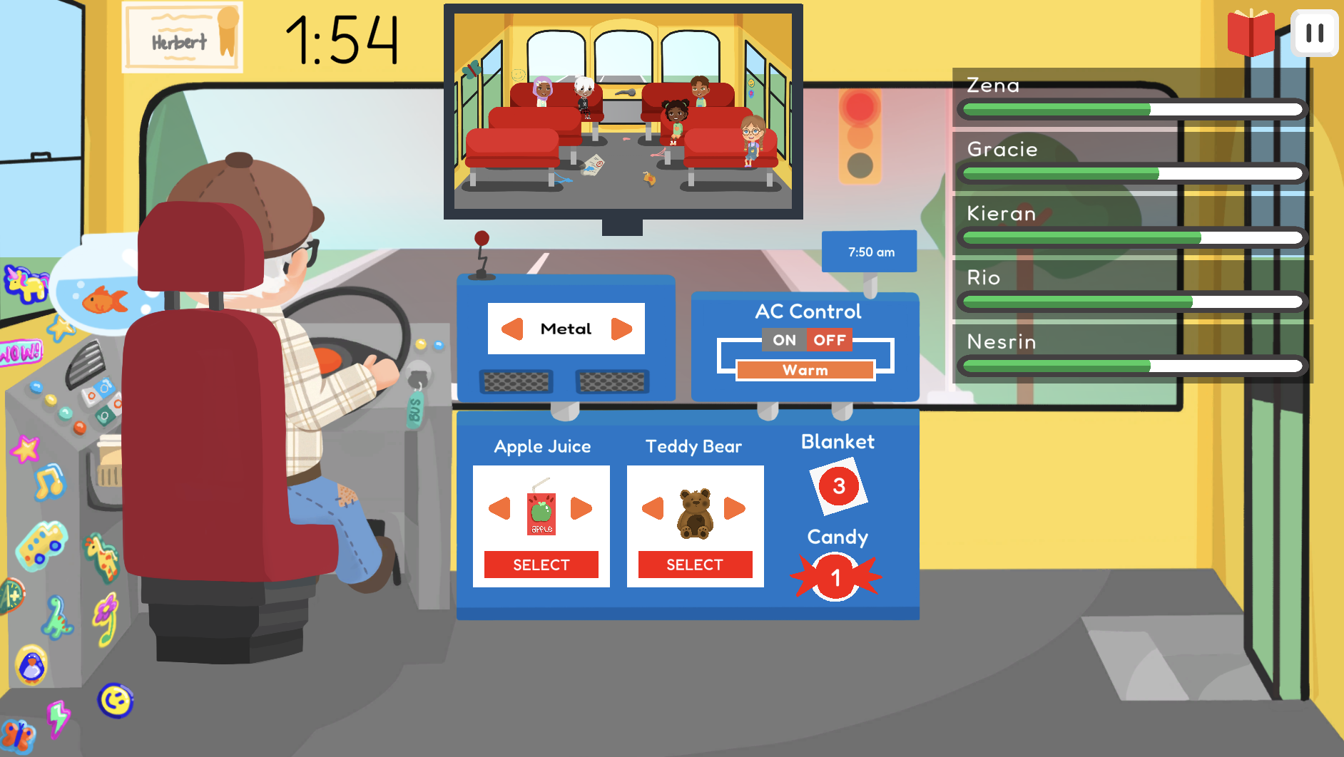
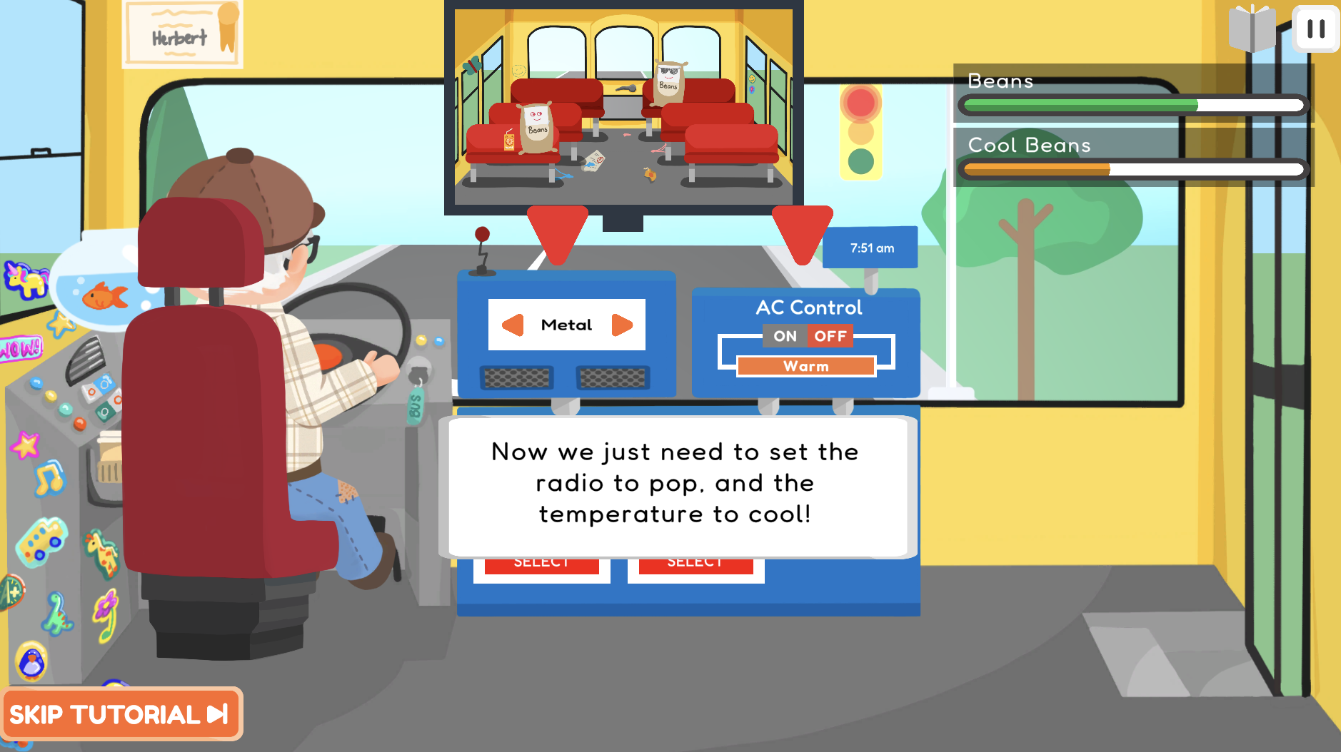
After our pitch, I started out building a version of the control board and bus in Blender to get down how we wanted the game to be laid out and give us the abilities to test different versions of how the player played the game. This also began the many iterations of the The All-In-One Child Management Dashboard System (ACMDS for short). My teammate and I started out building a simple version based on my pitch idea. I wanted the board to be intuitive and memorable, so I used a red buttons that contrasted the yellow board to stand out, changed them to green when pressed, and grey during the cooldown time. We decided on displaying the radio controls at the top, similar to a car where the radio is on a screen at the top of the console.
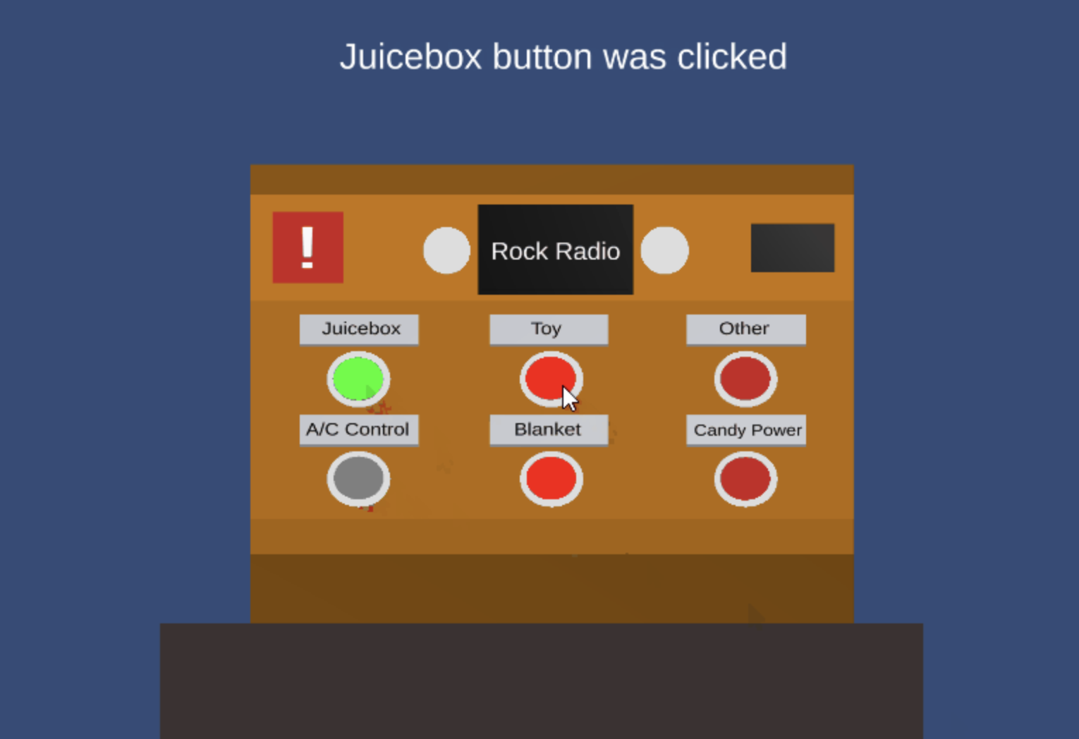

The colour of the board eventually ended up changing to blue to make it more memorable and the focal point of a user's attention against a yellow wall but going from a sketch in the pitch to bringing it to life in 3D just didn't cut it. We came up with a concept to include imagery within the ACMDS which took the board in a whole new direction.
In our Alpha version of the game, I was in charge of understanding how a user interacts with the control board and how effective my design was. I found a lot of users struggled to understand which specific buttons were interactive, especially when it came to the Air Conditioning controls. I realized that physical labels had to look much flatter than the other elements. Additionally, people were often confused by the combination of 3D and 2D elements.
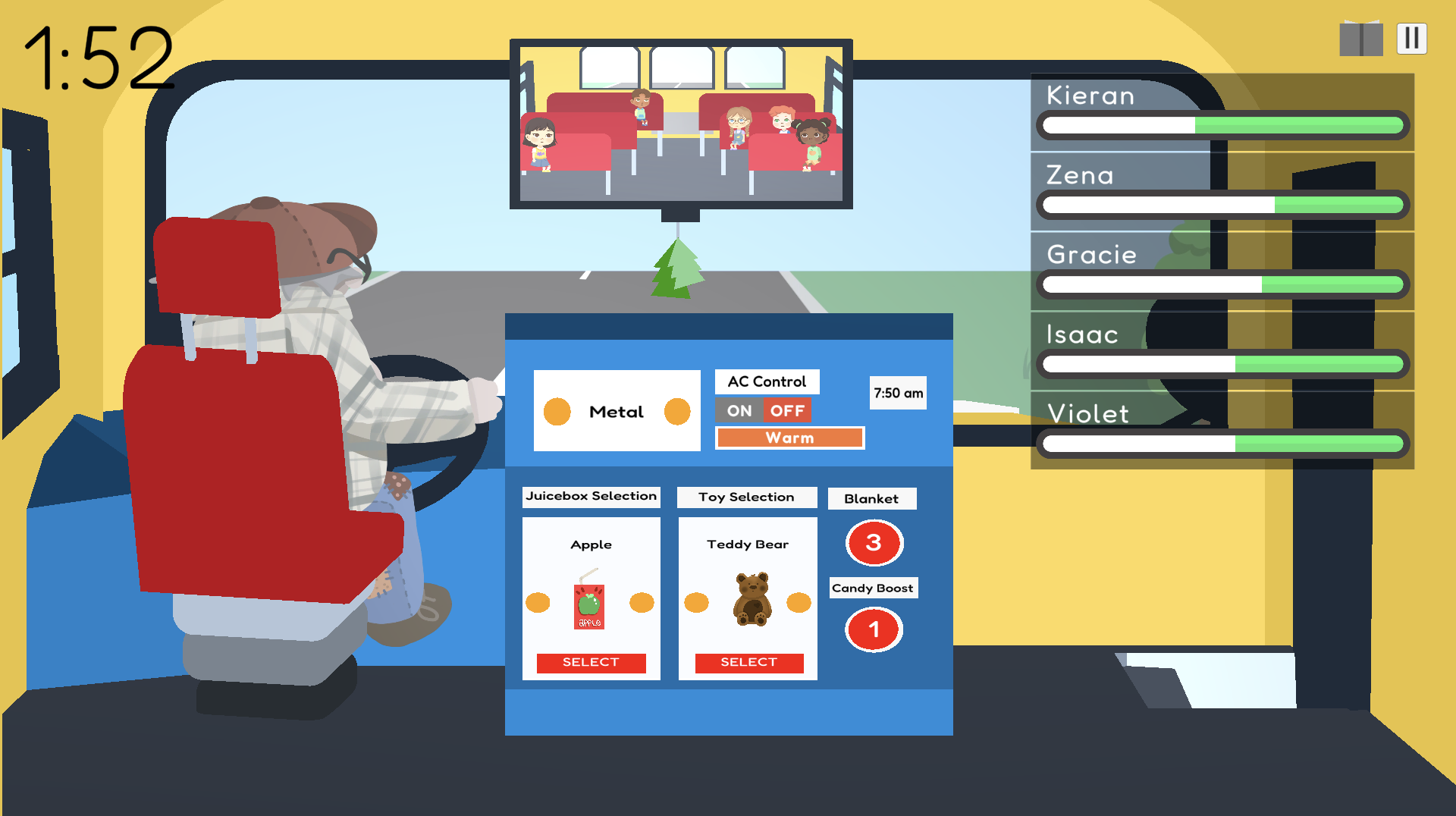
I expanded on the idea of using screens for the ACDMS and started developing a whole new shape for our control board in preparation for Beta. One piece of user feedback that we received during Alpha said that the board looked cluttered. I fixed the readability by separating different types of console commands into sections. Commands that impacted everyone went in their own individual sections and commands that impacted singular children were grouped together. I came up with a quirky and intuitive console concept that carried us through to Beta.

Our feedback on the console from Beta came back positive and had high results in terms of user readability compared to Alpha. A couple comments prompted some slight adjustments to finalize the ACMDS. I changed the shape of the switch buttons on the Juicebox, Toy, and Radio selection to become arrows since users didn't find the circles to be natural. I also darkened the colour of the control board so the labels didn't require a background and no longer be confused as possible buttons. In the end, the ACMDS was a smashing success.
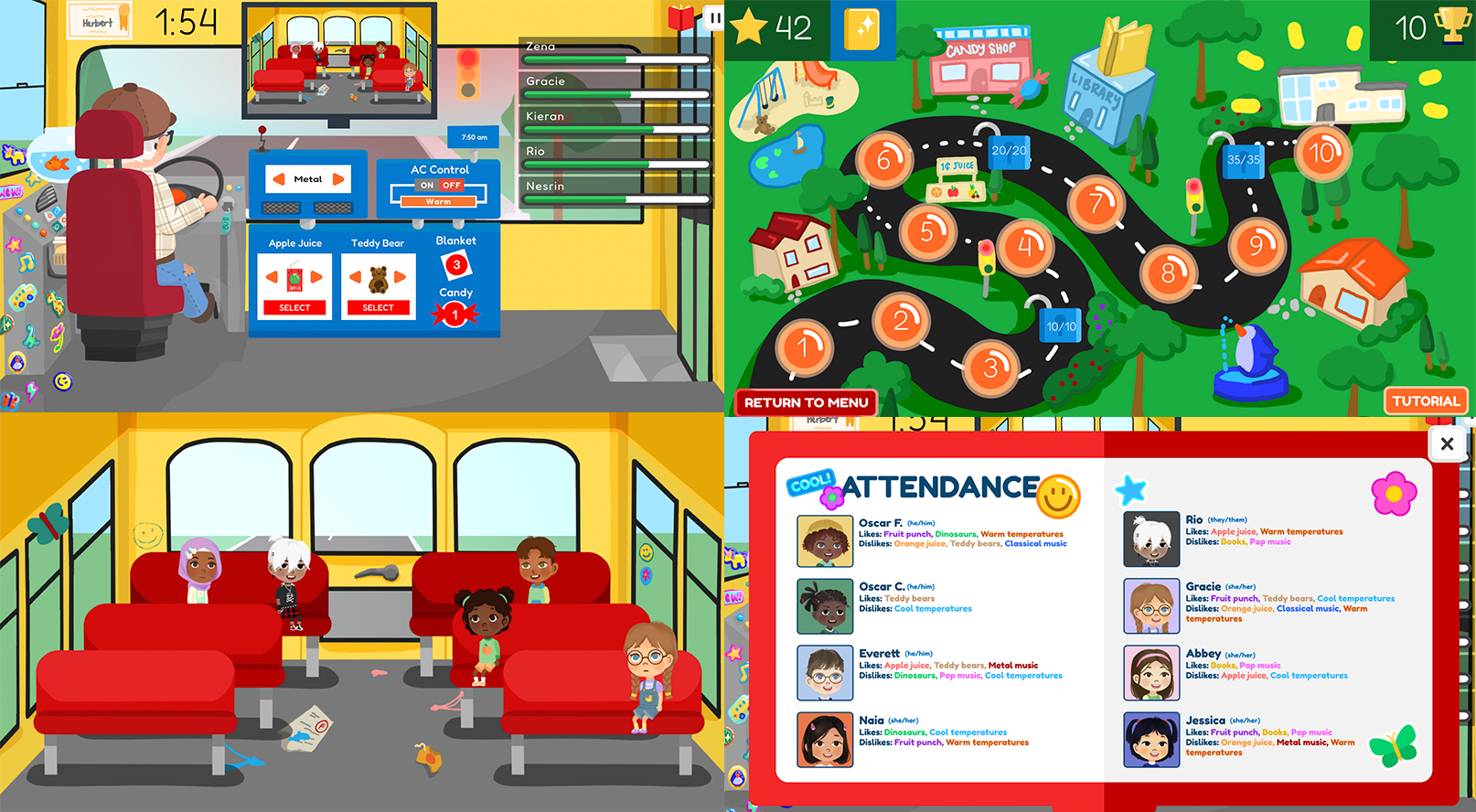
Attendance
I created the Attendance book by combining colour theory and document design. Each colour of each item corresponds to an item on the ACMDS. I spent some time before and after Alpha asking family and friends what colour came to mind when I said a word. The most common colours ended up in the final versions of the Attendance and we didn't receive any negative feedback on the readability of the Attendance book.

Development and Testing
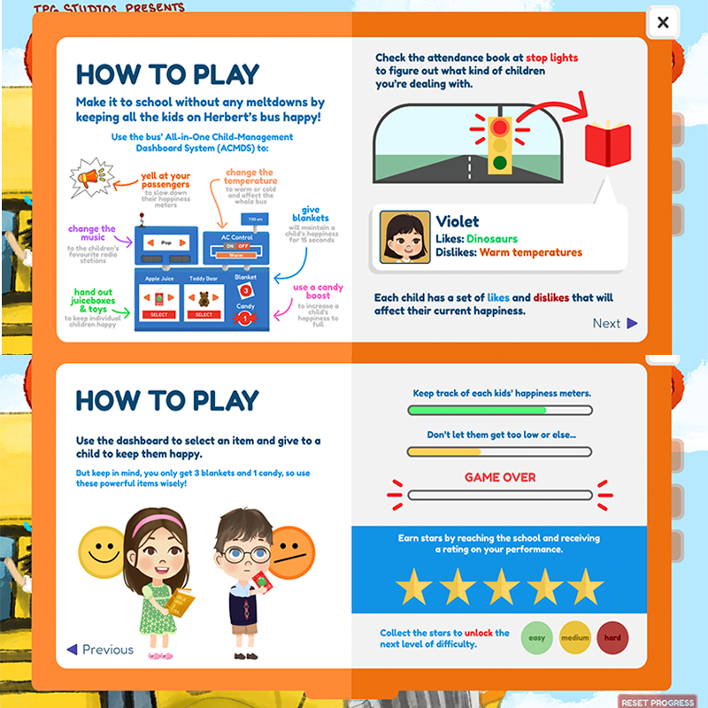
By far, our most common piece of feedback during the early phases of On The Struggle Bus was that the health bars were confusing because of how people perceive a health bar's movement and emptiness. I learned that although our health bars are right-aligned, having the health start at full and go down towards the right was not intuitive. In fact, many people thought that the white part of the health bar was what they needed to focus on and the children's health was going up during the game. This was an interesting discovery that made me realize the importance of left-to-right layouts as English readers and helped the team layout other portions of the game.
While testing the Alpha version, I also focused on how understandable the overall gameplay was. I observed some unexpected behaviours with people's understanding of how to use the Attendance book and, based on a tester survey, there was a general lack of understanding of the game's strategy. I learned quickly about the importance of affordance in game elements, especially for the Attendance which was often forgotten about due to the constant chaos of the gameplay. As a developer who knew the game pretty well, it became important for me to look at the game as though I had no experience playing it whatsoever and figure out ways to empathize with first-time players. This new perspective helped me write an effective instructions manual and, as we continued to develop levels for the game, allowed my teammate and I to write a tutorial level.
Tutorial and Instructions
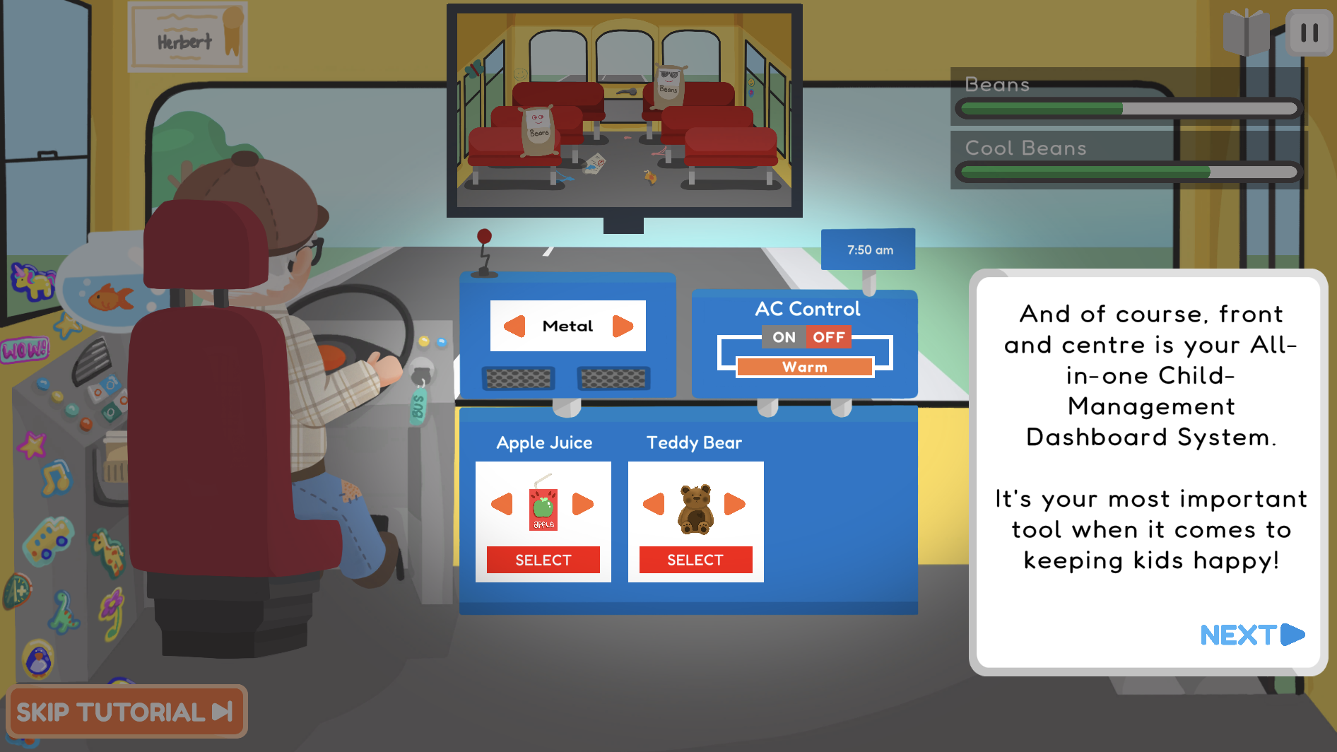
My teammate and I wrote and developed the Tutorial section of the game, where I spent my time going through user research from our Alpha and Beta versions and designing the experience to improve how a player understands the game using instructional dialogue and focal animations. We found that the most confusing part of the game was using the attendance at certain intervals, so we emphasized each use case of when someone would click on the Attendance: when they're at a stop light for 15 seconds and the in between when they're not allowed to use it. We gave explanations for why and how to use the attendance book effectively using animated arrows and large text boxes that the user goes through throughout the tutorial. The same animated arrows are used to demonstrate the control board and how to select children.
At the same time, I was developing the new and improved instructions manual. I focused on explaining each piece of the ACMDS, when the Attendance book can be used, and how the ACMDS impacts a child. It came down to trial and error to create effective graphics using Figma.
Storytelling
I wrote and designed a storyline that the player unlocks as they progress through the game and gain a sense of attachment to the main character, Herbert. The Storybook element also introduced new features on the control board and allowed for a better understanding of how to use them. I had a lot of fun writing a way to attach a player to a character that hardly speaks in a game that focuses on gameplay. It was definitely the icing on the cake for our game.
Environment
As we progressed into beta and into our final version of the game, I designed more quirky environments and replaced the 3D models with 2D illustrations from Procreate. With early 2000s games and early iPhone games in mind, the environment and experience is meant to be nostalgic overall. I took a lot of inspiration from the colour palettes of childhood TV shows (Backyardigans, Dora) and the layout of mobile games from companies such as Zynga. Making sure important elements were distinctive in shape and colour was important to me, as visible from the ACDMS. Another instance would be how the Attendance is always red, the Instructions are orange, and the Storybook is yellow.
I loved making this project and I'm so happy with the end result. Based on a final user testing, the final game was a success even for people who had never really played games before.